Chapter title pages (aka chapter start pages) in your PhD thesis are the double page at the beginning of each new chapter – obvious, right? These pages allow you to be creative. Hence, you should make the most of them! You can do that by reflecting the cover design on them. Or you can go a step further and tell the story of that chapter in one image. Here, I will give you a few examples chapter start page designs. Hopefully, you will be able to get inspired!

Designing a thesis is a lot of work! If you need some help, Contact me.
Here are some examples for chapter title page designs next to the corresponding cover:


Telling the story of your thesis on the chapter pages
Let’s start with a cover design that reflects the content of a thesis. This one is an inexpensive version of a real cover I made for someone:
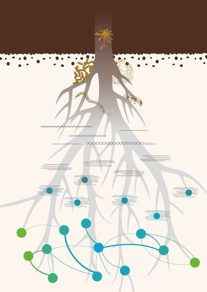
This PhD thesis dealt with the interactions of the soil microbiome. Especially in regards to the influence on plant growth. Now, let’s have a look at possible chapter page designs for this PhD thesis.
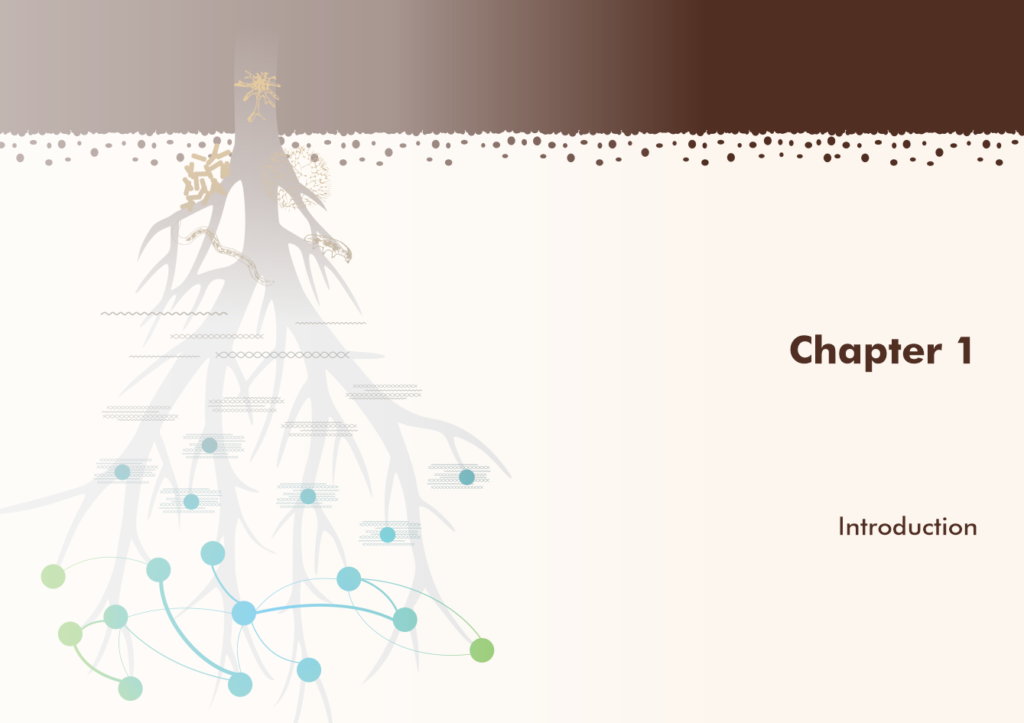
The first chapter is always the introduction, which deals with the entire story of the thesis. Here, you could render a subdued version of the cover design, like so:
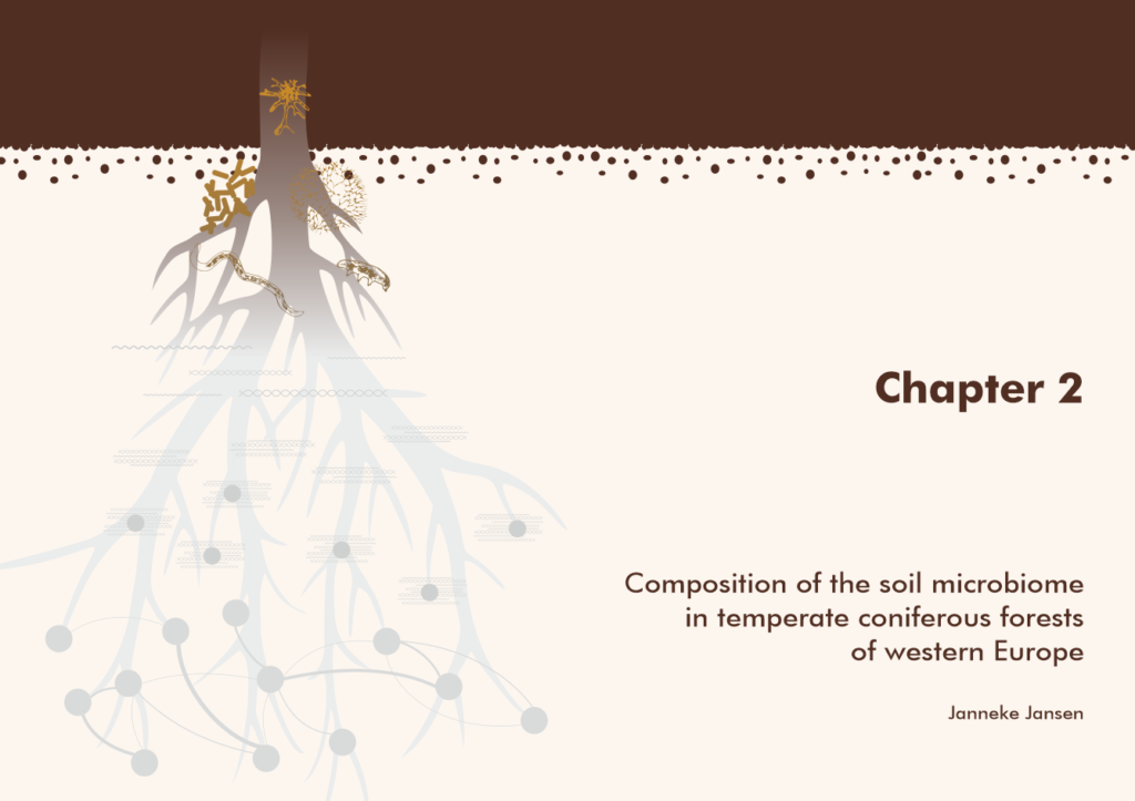
The second chapter of our hypothetical PhD thesis is a review about the species making up the soil microbiome. Hence, you could highlight the soil and the images of those species on the start page of chapter 2. A good way to do this is to keep them in color while putting everything else in shades of grey.
As the thesis goes on, the chapters deal with sequencing the microbiome and uncovering interactions between the species and abiotic factors. Therefore, you could keep up the principle of rendering the subject of the chapter in color while greying out everything else.
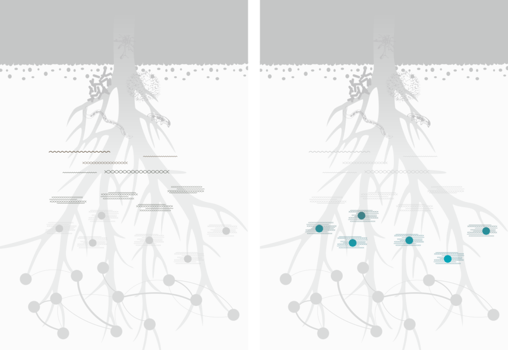
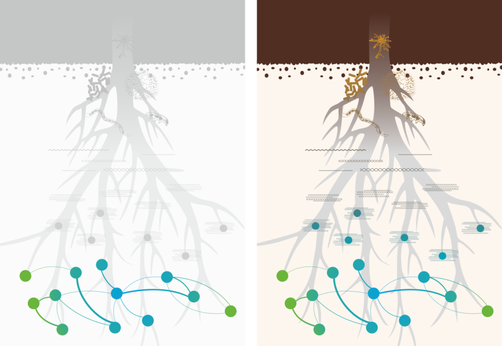
Chapter 6 is the discussion that ties the entire thesis together. Hence, it is in full color. If you have a limited budget, you can also show the relevant parts in black or dark gray while you leave the irrelevant parts for the given chapter in light gray. That way, you have twelve fewer colored pages in your printed thesis.
Using a philosophical principle rather than concrete images on the chapter start pages
This is another cheaper version of a thesis cover design I made (this time showing front and back cover):

The client wanted the impossible cube conceived by M.C. Escher on her thesis to illustrate how baffling and sometimes outright “impossible” it was to do a PhD.
For each chapter start page, we took one iteration of the cube. The Introduction is the foundation of the thesis, hence we show the foundation of the cube:

As the thesis progresses and the scientific story becomes more complete, the cube gets built up bit by bit. So far, so good. BUT then comes the impossible bit. Often, you will work on your project and everything seems fine and makes sense. However, a few years in you suddenly get results that don’t seem to corroborate the hypothesis that you have so painstakingly developed. Your story, and the cube, stop making sense.

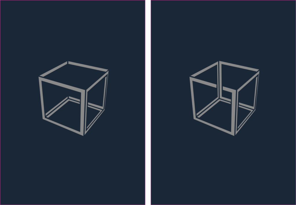

Well, for better or worse, you have to tie your thesis up in the discussion, making sense of the data that doesn’t quite seem to fit. That’s were we put a lid on the impossible cube.
This principle works just as well in black and white or grayscale, if you want to save some money.
Using photos on the chapter start pages of your PhD thesis
If you did a lot of field work, used a microscope or other imaging techniques, you may have a lot of interesting and/or pretty photos. There is no reason why you can’t use them on the chapter start pages of your PhD thesis!
Before we dive into the examples, here’s something really important: The images must be at least 176 x 246 mm for a single-page photo or 346 x 246 mm for a double-page photo. This includes bleed. AND they must be at least 300 dpi. This translates to a size in pixels of 2008 x 2835 for single-page photos and 4016 x 2835 for double-page photos.
If you have a smartphone with a very good camera, at least 12 MP, and good photo software, photos taken with your phone will be fine. However, smartphones with a really good camera and the accompanying software are usually high-end and cost around 1000 Euros. If you have a simple phone, the image quality might not cut it, even if you have enough megapixels.
In the latter case, you will need a DSLM or DSLR camera with a good lens to take beautiful photos. If you go to a foreign country to do field work, you might want a good camera to capture your adventures anyway. So, why not use those photos on the chapter pages of your PhD thesis?
Chapter start pages with field work photos
Let’s start with a field work example. Say you went to Peru to study the agricultural importance of the cape gooseberry (Physalis peruviana). The following are examples of how you could use photos on your chapter start pages (I show all double pages here).
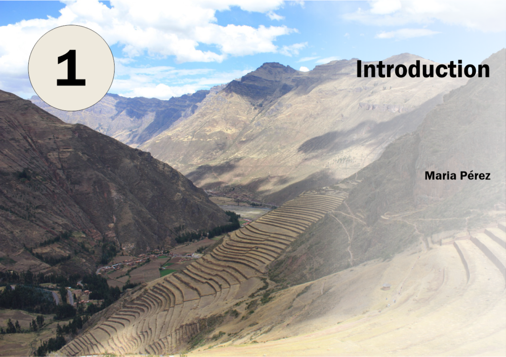
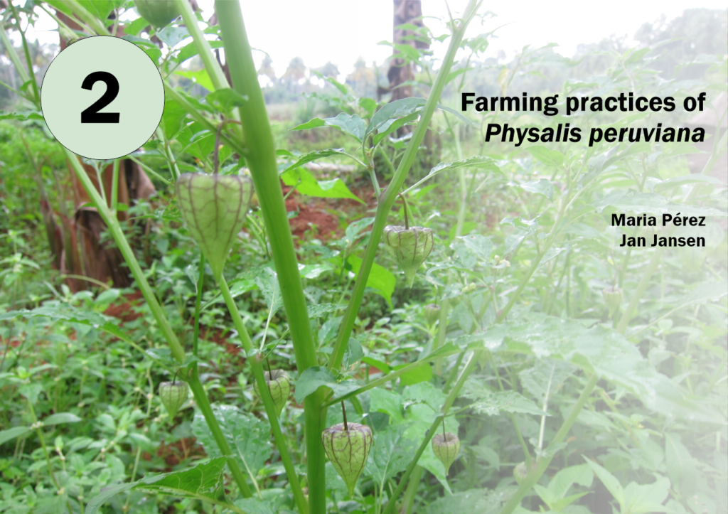

You can see that this time, I put the chapter numbers on the left-hand page and omitted the word “Chapter”. The color of the circle that contains the chapter number is the same as the color of the lower right corner of the double page. this ties the entire double page neatly together.
Chapter start pages with pretty data
If your PhD involved a lot of bioinformatics and data visualization, you can use the aesthetically pleasing parts of some of your diagrams on your chapter start pages, like so:
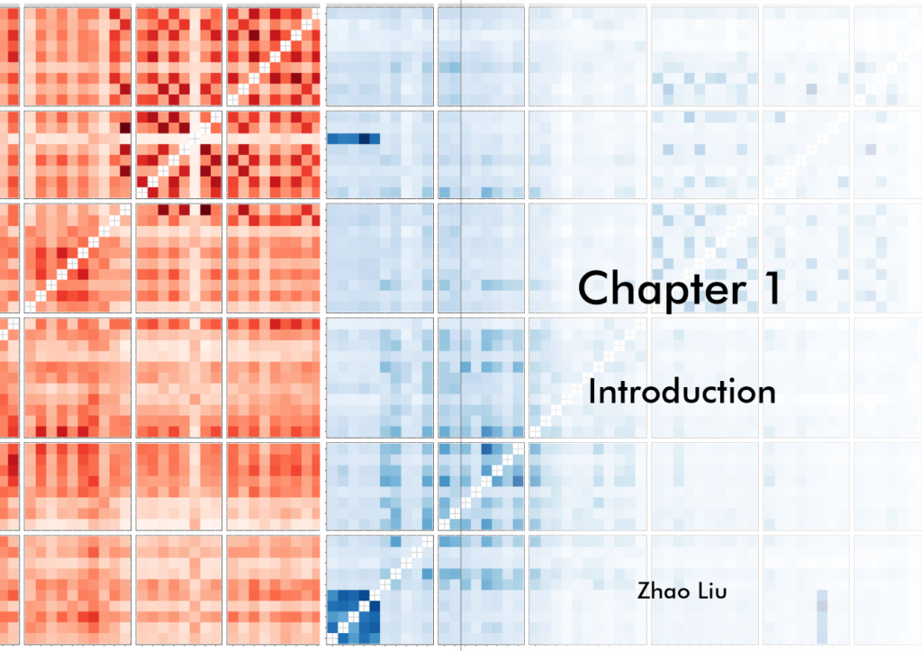
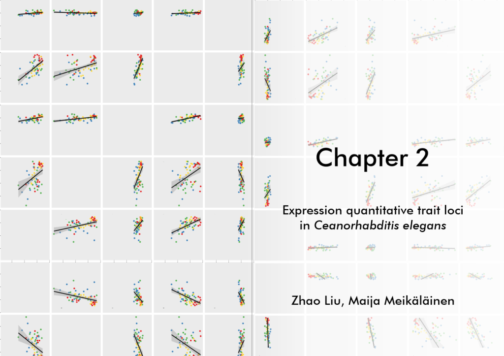

Both photographs and diagrams may also work as grayscale images, depending on the amount of contrast in the photos and the types of diagrams you are using.
